Blank walls in a rental can feel more like a restriction than a design opportunity, especially when you want personality but also your deposit back.
A diy photo gallery wall layout solves that tension, giving you a planned, cohesive display that looks intentional, modern, and completely renter safe.
Instead of randomly hammering nails and hoping for the best, you treat your wall like a layout grid, where every frame spacing choice, alignment line, and image size has a clear purpose.
By the end of this guide, you will know exactly how to map out a gallery wall plan on the floor, translate it to the wall with paper templates, and hang everything securely, including options for hanging without nails.
No specialized tools, no permanent damage, just a smart system and a bit of patience.
Why a diy photo gallery wall layout matters for renters
Most rental homes have beige walls, awkward light switches, and at least one strangely placed thermostat.
When you throw frames onto the wall without a plan, the result often looks messy and temporary, which is the opposite of the calm, pulled-together atmosphere you probably want.
A diy photo gallery wall layout helps you:
- Avoid random holes and extra patching later.
- Create a cohesive focal point that feels like a design feature, not clutter.
- Use frame spacing and size to visually balance furniture, windows, and doors.
- Make smarter choices about hanging without nails, so nothing crashes down at 3 a.m.
- Build a gallery wall plan that you can pack up and recreate in your next home.
Seen this way, your gallery wall stops being a risky decor experiment and becomes a portable, flexible design asset you can take from rental to rental.
Step 1: Build a clear gallery wall plan before touching the wall
Good gallery walls start on paper or on the floor, not directly on the wall.
Before you think about hooks or strips, you need a gallery wall plan that decides what goes where and why.
Define the purpose of this wall
Ask yourself what this wall should communicate when someone looks at it.
- Do you want it to feel calm and minimal, with lots of breathing space between frames?
- Would you rather have a collected, art-studio mood with different sizes and an organic shape?
- Are you highlighting personal photos, abstract art, posters, or a mix of everything?
- Should the display anchor a sofa, frame a TV, float above a console, or stand alone on an empty wall?
- Will you need this layout to be adaptable if you move to a place with different wall dimensions?
Once this intention is clear, every later decision about size, spacing, and alignment becomes easier and more consistent.
Measure your wall and furniture
Gallery walls look best when they relate to nearby furniture and architecture.
Use this simple sequence:
- Measure the full width and height of the wall section you plan to use.
- Measure any furniture below it, like a sofa, console, or bed, focusing on width and height.
- Leave at least 15 to 20 centimeters of space between the top of the furniture and the lowest frame, so the wall does not feel crowded.
- Keep most gallery walls within the central two thirds of the wall width for a balanced look.
- Aim for the visual center of the overall arrangement to sit roughly at eye level, usually around 145 to 155 centimeters from the floor.
These numbers are guidelines, not rigid rules, yet they give you a reliable starting point so the gallery looks anchored rather than floating.
Decide on a general layout style
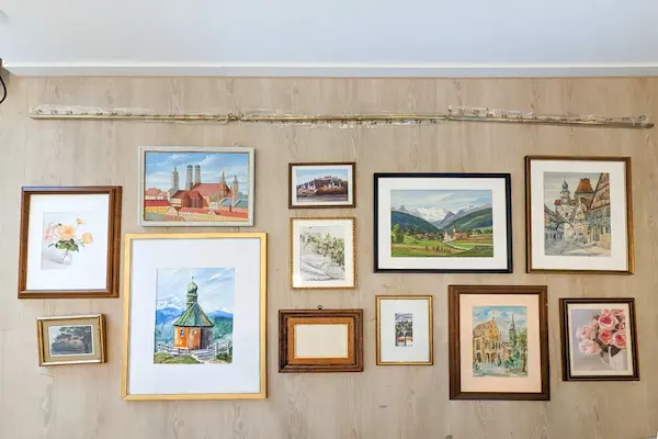
Every gallery wall plan fits loosely into one of four shapes, and choosing one in advance simplifies every later detail.
- Grid layout: Frames in neat rows and columns with consistent frame spacing, perfect for a modern, minimal vibe.
- Row layout: Frames aligned along one main horizontal line, ideal for above a sofa or bed.
- Organic cluster: Frames arranged around a loose center point with varied spacing, giving a collected, gallery-like feel.
- Salon wall: Many frames in different sizes and orientations covering a larger area, reminiscent of art museums and old salons.
If you like structure and simplicity, a layout grid will probably satisfy you most.
If you enjoy a more relaxed and layered look, an organic cluster or salon style will feel more natural.
Step 2: Choose frames and art for a cohesive story
Even the best diy photo gallery wall layout fails if the frames and art fight each other.
Cohesion does not mean everything must match perfectly, but it does mean there are one or two unifying elements that tie the whole wall together.
Pick a frame palette
Instead of buying frames one by one, think in terms of a palette, just like choosing colors for a room.
Consider these approaches:
- One color, many sizes: All black frames in multiple sizes look modern and calm.
- Two tones, one accent: For example, black and oak frames with one metallic accent piece.
- Same style, mixed colors: Simple thin frames in black, white, and natural wood, all with a similar profile.
- Same color, mixed textures: Matte black, brushed black, and slightly distressed black frames still feel related.
For renters, thin profiles and lightweight materials are ideal, because they work better with hanging without nails.
Coordinate matting and image sizes
Matting and image scale influence how airy or dense your gallery wall feels.
Follow this framework:
- Use matting to create breathing space around smaller photos, especially in a grid layout.
- Keep mat border widths consistent across similar frame sizes for a polished appearance.
- Mix a few larger pieces with several smaller ones instead of using many tiny frames, which can look busy and scattered.
- Repeat at least one or two image sizes three or four times across the layout to create rhythm.
- Avoid mixing too many orientations if you are going for a strict grid, since that can undermine the clean structure.
Balanced repetition makes your eye move comfortably across the wall instead of stopping at random spots.
Curate a theme without overthinking
A theme does not have to be literal or obvious.
You can tie your gallery together through:
- Color palette, for example neutrals with one accent color.
- Subject type, such as travel photos, architecture, or nature.
- Mood, like calm minimal abstract art or energetic graphic prints.
- One repeating element, for example a recurring horizon line, black-and-white photography, or line drawings.
As long as at least one of these threads appears in multiple pieces, the gallery wall reads as a deliberate composition rather than random decor.
Step 3: Design your layout grid on the floor
Planning on the floor lets you experiment freely without committing to any holes or adhesive.
This stage is where the diy photo gallery wall layout really takes shape as a physical arrangement.
Create a working “canvas” on the floor
To simulate the wall area, follow this process:
- Use painter’s tape or masking tape to mark out a rectangle on the floor matching the wall area you measured.
- Include the approximate width of the furniture piece below so you can see proportions.
- Place each frame inside this taped “canvas,” starting with the largest piece as your anchor.
- Build outward from that anchor, adding medium frames, then smaller ones to fill gaps.
- Keep your phone handy and take photos of different arrangements, so you can compare them side by side.
This practice gives you the freedom to move frames around without stress, until the grid or cluster feels balanced.
Use a simple layout grid strategy
When building your layout, imagine faint vertical and horizontal lines running through the arrangement, even if you prefer an organic look.
Here are three easy layout grid approaches:
- Strict grid: Frames align perfectly in rows and columns, with identical frame spacing both vertically and horizontally, creating a very modern look.
- Soft grid: Frames roughly align along a few main rows or columns, but may shift slightly to accommodate different sizes while still feeling orderly.
- Axis plus cluster: One strong vertical or horizontal line of frames anchors the design, while other frames cluster around it more freely.
Even in an organic gallery wall plan, these imaginary lines keep the display from feeling chaotic.
Follow a practical frame spacing chart
Frame spacing is the secret ingredient that makes the wall look cohesive instead of messy.
Use this spacing chart as a flexible guideline:
- Very small frames (up to 13 x 18 cm): 3 to 5 cm between frames.
- Medium frames (around 20 x 25 cm to 28 x 35 cm): 5 to 7 cm between frames.
- Large frames (40 x 50 cm and bigger): 7 to 10 cm between frames.
- Strict grid layouts: Choose one distance, such as 5 cm, and keep it consistent in every direction.
- Organic layouts: Vary spacing slightly within the recommended ranges, but repeat a few distances to keep a sense of rhythm.
Renter friendly gallery walls benefit from slightly tighter spacing, because the overall footprint stays compact and easier to translate in a new home.
Step 4: Use the paper template method to transfer the layout to the wall
Once you love the arrangement on the floor, the next step is getting it onto the wall without guessing or constant re-measuring.
The paper template method acts like a full-size map of your diy photo gallery wall layout.
Create paper templates for each frame
You do not need special materials for this technique.
Follow this numbered sequence:
- Place each frame on a large sheet of kraft paper, wrapping paper, or taped-together printer paper.
- Trace around the frame to create its exact outline on the paper.
- Cut out the paper shape and label it with a short description, such as “Black 20 x 25 abstract,” so you know which frame it represents.
- Mark the hanging point on the paper by measuring the distance from the top of the frame to the hook or hanging hardware on the back.
- Transfer that measurement onto the paper template, drawing a small “X” where the nail, screw, or adhesive hook will go.
With this preparation, every template becomes a precise placeholder for the frame on your wall.
Tape the templates to the wall
Now you will recreate the floor layout vertically.
- Use low-tack painter’s tape to attach each template to the wall at the correct height and position.
- Start with the anchor piece in the center or above the main furniture item, then work outward just as you did on the floor.
- Check spacing between templates with a ruler, keeping to your spacing chart, adjusting slightly if needed.
- Step back often to view the entire wall and confirm that the overall shape feels balanced.
- Take photos again in case you want to test small shifts and compare options.
This stage is the best time to correct any visual imbalance, since you can peel and move templates without leaving marks.
Confirm alignment lines and eye level
Before you commit to hanging, refine your alignment.
- Check that the top edges of frames meant to align in a row are level with each other.
- Make sure the visual center of the gallery sits close to eye level for most viewers.
- Verify that the layout relates nicely to doors, windows, and ceiling lines, not pulling too high or too low.
- Ensure that no template awkwardly overlaps outlets, switches, or thermostats.
- Adjust a few millimeters if needed to dodge obstacles while keeping the overall grid readable.
Once the templates look right, the hard work of planning is done, and hanging becomes almost mechanical.
Step 5: Master frame spacing and alignment tricks
Even a simple gallery wall plan looks more professional when you apply a few alignment tricks.
Small refinements in spacing, height, and symmetry create a sophisticated, modern impression.
Use one main alignment line
Professional installers often think in terms of one dominant line that holds the layout together.
You can choose between:
- A shared top line, where the top of several frames align, ideal above headboards or tall furniture.
- A shared bottom line, where the bottom edges align, often used above consoles and sofas.
- A central horizontal line, where the centers of all frames sit along a single imaginary axis.
- A strong vertical axis that divides the arrangement into left and right halves, great for symmetrical spaces.
After picking your main line, let other frames orbit around it, sometimes breaking the line slightly for personality while still respecting its presence.
Balance heavy and light visual weight
Large or dark frames feel visually heavier, while small or light frames feel lighter.
Use these tips to avoid lopsided compositions:
- Place the visually heaviest frame or artwork near the center of the arrangement.
- Avoid stacking all large or dark pieces on one side, as that makes the gallery feel tilted.
- Mix sizes and tones across the wall so that each side feels equally weighted.
- Use brighter or more detailed pieces to draw attention toward the center, not just the edges.
- Group small frames in twos or threes to counterbalance a larger piece on the opposite side.
Thoughtful distribution creates a calm, structured feeling, even when the shapes vary.
Align with furniture and architecture
Your gallery wall does not exist in isolation, so it should cooperate with the objects around it.
- Center the entire gallery over the main furniture piece whenever possible.
- Let side edges of the gallery approximately match the width of the furniture below, or extend just a little beyond it.
- Maintain similar margins between the gallery and nearby windows, doors, or corners.
- Keep the bottom row of frames comfortably above the furniture to avoid a cramped look.
- For narrow walls, consider a vertical layout grid that echoes the shape of the wall itself.
Alignment with the room architecture makes the gallery feel truly integrated and intentional.
Step 6: Hanging without nails – renter safe methods
Renters often worry most about the actual hanging stage, especially if the lease discourages holes in the walls.
Fortunately, there are several methods for hanging without nails, as long as you respect weight limits and wall conditions.
Adhesive picture strips and hooks
Adhesive systems designed for picture hanging are the most popular renter-friendly solution.
When using them, follow a cautious process:
- Choose products rated for at least the weight of each frame, erring on the higher side for safety.
- Clean the wall surface with a gentle cleaner and let it dry completely before applying anything.
- Apply the adhesive strips or hooks following the manufacturer’s instructions carefully, including wait times before hanging.
- Press each frame firmly into place and support it briefly to help the adhesive bond.
- Avoid exceeding recommended weight thresholds, especially on painted drywall, to reduce the risk of damage.
If you are unsure, use adhesive solutions only for lighter frames and switch to traditional hardware for heavier pieces where your lease allows.
Slim nails or pins for minimal damage
Some rentals allow small holes as long as they are patched when you move out.
In that case, consider slim hardware:
- Use thin picture hanging nails or wall pins that create tiny, easy-to-fill holes.
- Aim for studs or use lightweight frames on hollow sections of wall.
- Combine small nails with the paper template method so you only make each hole once.
- Keep heavier frames on secure hangers with multiple nails for safety.
- Patch holes later with lightweight filler and paint that matches your wall color as closely as possible.
Tiny, well-planned holes are often less noticeable than peeling paint from poorly removed adhesive, so choose the approach that best fits your rental agreement.
Rail or ledge based solutions
Where your lease strongly discourages holes, you can sometimes avoid direct wall hanging.
Options include:
- Lean framed art on a long picture ledge mounted with minimal, well-placed hardware.
- Place larger frames on top of a console, dresser, or shelf, leaning against the wall.
- Layer smaller frames in front of larger ones for depth without extra hanging points.
- Use tall furniture pieces to display art, turning the furniture itself into a mini gallery.
- Arrange a mix of leaning frames and a few light, adhesive hung pieces for a hybrid look.
These strategies minimize damage while still giving you the feel of a gallery wall.
Step 7: Install the frames using your templates
With your gallery wall plan mapped and renter-safe hanging methods chosen, the final installation becomes very straightforward.
The goal now is accuracy and patience, not speed.
Mark and mount hardware through the templates
Instead of guessing, use the “X” marks on your templates.
- For each template, make a small pencil mark on the wall at the hanging point.
- Install the chosen hardware, whether adhesive strip, hook, nail, or screw, following all safety instructions.
- Gently remove the paper template, leaving only the hardware in place.
- Hang the corresponding frame carefully, checking that it catches the hardware securely.
- Repeat for all frames, starting from the center or anchor piece and working outward.
This process ensures that the wall arrangement matches the layout you perfected on the floor.
Fine tune leveling and spacing
Once everything is on the wall, small adjustments make a big difference.
- Use a small bubble level or level app to check horizontal alignment.
- Nudge frames slightly to close tiny gaps and keep consistent frame spacing visible.
- Step back to inspect the wall from different angles and distances.
- Correct any frame that visually drifts out of the grid or cluster shape.
- Take a final photo for reference in case you ever move and want to recreate the diy photo gallery wall layout.
After this stage, your gallery wall should look deliberate, balanced, and surprisingly professional.
Example gallery wall plans you can copy
Sometimes the hardest part is imagining a starting point, so a few plug-and-play ideas help you move faster.
These examples use simple gallery wall plan concepts you can adapt to your own frames and art.
Above the sofa – soft grid layout
For a typical three seat sofa, consider this configuration:
- Use one large horizontal frame in the center, roughly two thirds the width of the sofa.
- Place two medium vertical frames on each side of the large piece, aligning their centers to a common horizontal line.
- Add two smaller frames above the medium ones, staggering them slightly upward for a soft grid effect.
- Keep frame spacing at about 5 to 6 cm between all frames for a clean look.
- Hang the bottom of the central frame roughly 15 to 25 cm above the top of the sofa back.
This arrangement feels modern and calm while still showing multiple pieces.
Hallway or entry – vertical axis cluster
Narrow walls pair well with vertical compositions.
Try this structure:
- Choose one medium or large frame in the vertical center of the wall.
- Place two or three smaller frames above it, following a loose vertical line.
- Add two smaller frames below, stopping at a comfortable eye-level center.
- Keep spaces between vertical frames slightly smaller than side spaces for a totem like feeling.
- Use a consistent frame color to avoid visual clutter in the narrow space.
This design gives your hallway personality without overwhelming it.
Bedroom – asymmetrical cluster above a dresser
For a dresser or console, an asymmetrical grouping creates a relaxed vibe.
- Place one large frame slightly off center above the dresser, not perfectly centered.
- Add two medium frames on one side, forming a loose L shape with the large one.
- Fill the opposite side with three smaller frames in a triangle configuration.
- Maintain slightly varied frame spacing within the 4 to 7 cm range for a softer look.
- Complement the gallery with a lamp, plant, or tray on the dresser to connect wall and surface.
A layout like this feels collected over time, while still benefiting from your careful planning.
Keeping your gallery flexible for future rentals
One powerful advantage of a diy photo gallery wall layout is how repeatable it becomes.
With a bit of documentation, you can treat your wall as a modular design system rather than a one time project.
Use these ideas to keep things flexible:
- Take clear photos of your final wall straight on, and save them in a dedicated folder.
- Sketch a simple diagram showing frame sizes and frame spacing used in your layout grid.
- Label the back of each frame with its position, such as “Top left” or “Center bottom.”
- Store your paper templates in a flat folder so you can reuse them in your next place.
- Keep a small note of which hanging method worked best for each frame weight and wall type.
With this information, you can rebuild your gallery in a new rental with far less effort and time.
Final checks for a cohesive, renter safe gallery wall
Before you call the project done, run through a quick checklist so your gallery wall feels both polished and secure.
Ask yourself these questions:
- Does the overall shape of the gallery suit the wall and nearby furniture?
- Are frame spacing and alignment consistent enough to look intentional?
- Have you respected weight limits for adhesive solutions and other hardware?
- Does the gallery reflect a cohesive theme, color story, or mood?
- Is everything stable when gently tapped, with no frame feeling loose or insecure?
If the answer is yes to all of these, you have achieved exactly what a diy photo gallery wall layout should deliver.
Your wall now looks like a design choice, not a compromise, and you can enjoy that stylish, personal display without stressing about your rental agreement.