Understanding portfolio website basics for beginners becomes far less intimidating when the entire process is broken into clear, modern and trustworthy steps that guide you from the earliest planning decisions to the final launch, especially if you are a creative professional building your first online presence and want a portfolio that feels clean, cohesive and representative of your identity without needing to dive into complex coding concepts, advanced development tools or overwhelming design systems that create more confusion than clarity.
Because a portfolio exists primarily to showcase your work, communicate your skills and provide a simple path for potential clients, collaborators or employers to understand who you are and how to contact you, learning the fundamentals in a structured and stepwise way ensures you avoid common mistakes and build a website that looks polished even if your technical knowledge is minimal.
Most creators entering the world of portfolio sites for the first time feel unsure about which sections to include, how many projects to display, what copywriting tone to use, which images to upload, how to size or optimize visual content, and how to ensure their site remains accessible, readable and easy to navigate for different types of visitors.
Instead of approaching your site as a complex technical project, viewing it as a clear storytelling framework helps you emphasize the pieces that matter most: your about page, your featured projects, your contact options and the aesthetic consistency that ties everything together.
This guide presents portfolio website basics for beginners in long, detailed explanations that help you understand structure, layout logic and user clarity while offering templates, suggestions and examples that reflect current best practices for creatives.
Why a Portfolio Website Matters for Beginners
A portfolio website acts as your digital home base and introduces you to people before you ever meet them, meaning it becomes one of the most valuable tools for any creative entering the professional world. Even simple portfolio site designs that use minimal elements can create a trustworthy first impression, because clarity, organization and consistency communicate professionalism without requiring elaborate aesthetics or advanced customization. When you build a portfolio with intention, you give viewers an organized path to understand your skills, style, strengths and personality, all while presenting your work samples in ways that convey confidence and competence.
Key Benefits of a Beginner Portfolio Website
- Serves as a centralized collection of your best project examples.
- Shows growth, range and direction of your creative abilities.
- Gives potential clients or employers a quick way to evaluate your fit.
- Displays your personal voice through thoughtful copywriting.
- Provides contact options that make inquiries smooth and simple.
- Strengthens credibility even before you gain professional experience.
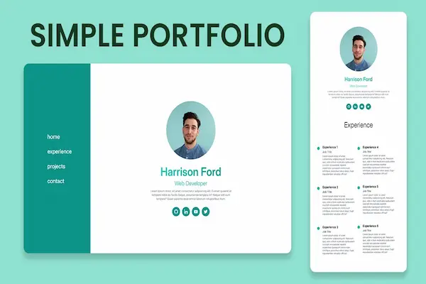
Structure Blueprint: The Core Layout of a Simple Portfolio Site
A beginner-friendly portfolio website benefits from a streamlined structure that follows a predictable navigation flow, because visitors typically prefer to access information quickly without needing to dig through multiple layers. Using a minimalist blueprint as your starting point prevents unnecessary complexity and ensures the site remains focused on your work rather than extraneous elements.
Essential Pages Every Beginner Portfolio Needs
- Home: a clean welcome section that introduces your creative identity.
- About: a short but meaningful overview of who you are and what you do.
- Projects: a gallery or case-study section showing selected work.
- Contact: simple ways to reach you, ideally through multiple formats.
Optional Pages That Add Depth
- Services overview if you freelance or offer specific creative work.
- Skills section separating technical and soft skills.
- CV or resume page for detailed professional history.
- Blog or writing samples if content creation is part of your portfolio.
How to Write Clean and Effective Portfolio Copy
A portfolio does not require long paragraphs of marketing language; instead, concise and modern copy communicates expertise clearly while ensuring visitors feel guided rather than overwhelmed. Copywriting for a beginner portfolio site should feel approachable, confident and consistent across pages, and each section benefits from focusing on clarity rather than elaborate storytelling.
Copy Tips for a Strong Home Page
- Use a short headline summarizing your creative identity (“Visual Designer with a Minimal Style” or similar).
- Add a brief subheadline describing your specialty areas.
- Include a quick call-to-action pointing viewers to your best project.
- Keep the tone modern but neutral to appeal to broad audiences.
Copy Framework for Your About Page
- Share a factual, concise introduction (“I’m a creative focused on…”).
- Highlight tools, interests or industry focus without overexplaining.
- Describe your approach in one or two sentences (“I aim to create…”).
- Include a soft personal detail that humanizes your profile.
Copy Tips for Project Pages
- Summarize each project in one sentence before adding details.
- Explain your role: design, writing, research, strategy, etc.
- List tools and skills used in the project.
- Describe challenges and results briefly.
- Avoid overly technical explanations unless relevant to your audience.
Image Sizes and Visual Consistency Basics
Cohesive visuals elevate even the simplest portfolio website basics for beginners, because polished imagery conveys professionalism instantly. Beginners often overlook image size consistency, file compression or white-space balance, yet these small details significantly impact perceived quality.
Recommended Image Practices
- Use consistent aspect ratios (e.g., 4:3 or 16:9) for project thumbnails.
- Choose wide images for hero sections (recommended: 1600–2200px width).
- Use medium-size images for gallery previews (recommended: 900–1200px width).
- Compress images enough to maintain fast loading while keeping clarity.
- Avoid uploading screenshots with clutter or multiple window borders.
Visual Layout Tips
- Leave generous padding between sections for a modern feel.
- Use no more than two typefaces to maintain simplicity.
- Maintain consistent color use across all pages.
- Choose a neutral background to keep focus on your work samples.
- Align images and text carefully for a clean layout.
Accessibility Basics for Beginner Portfolio Sites
Accessibility ensures your portfolio is usable by a wide range of people, including those with visual, auditory or mobility-related needs. Making your website accessible demonstrates respect for all users and enhances usability for everyone, even those without specific accessibility requirements.
Simple Accessibility Guidelines
- Ensure text has sufficient contrast against the background.
- Use descriptive alt text for all images in your projects.
- Keep link and button labels clear (“View Project,” “Contact Me”).
- Use readable font sizes, ideally 16px or larger.
- Maintain consistent heading hierarchy for screen readers.
Keyboard and Navigation Tips
- Test whether all buttons and links work via keyboard only (tab navigation).
- Ensure focus indicators remain visible while navigating.
- Make forms simple and easy to complete without a mouse.
- Use descriptive labels for form fields (“Name,” “Email,” etc.).
Project Selection: How to Choose What Goes in Your Portfolio
Selecting projects strategically can transform a simple portfolio site into a memorable experience for viewers. Many beginners assume they must showcase everything, yet curation often strengthens your brand by highlighting the work most aligned with your goals.
Guidelines for Selecting Projects
- Show quality over quantity—3 to 6 strong projects outperform 20 mediocre ones.
- Select projects that reflect your current skill level, not outdated work.
- Choose pieces that represent the type of work you want more of.
- Include examples that demonstrate range when relevant (e.g., branding + illustration).
- Remove projects that no longer align with your direction.
How to Present Projects in a Clear, Modern Format
The way you present your projects matters because presentation shapes how viewers interpret your skills. Using structured pages or sections ensures each case study communicates value efficiently and cleanly.
Starter Case Study Structure
- 1. Project Summary: a single sentence describing the goal.
- 2. Role: your specific responsibilities.
- 3. Tools: the software or skills used.
- 4. Process: short description of your thinking steps.
- 5. Outcome: final results and key takeaways.
Quick Case Study Checklist
- Keep paragraphs short and visually easy to scan.
- Use numbered steps to communicate process stages.
- Show a before/after comparison only when meaningful.
- Avoid oversharing sketches or iterations unless relevant.
- End with one sentence about what you learned.
Tips for Writing a Persuasive About Page
The about page plays a crucial role in portfolio website basics for beginners because it bridges the gap between your work samples and your personality, offering visitors insight into who you are as a creative. A well-written about page feels authentic, grounded and relevant to the work you produce.
About Page Essentials
- Open with a brief, clear introduction describing your creative identity.
- Explain your approach or philosophy without sounding exaggerated.
- Share one personal detail that adds warmth but remains professional.
- Demonstrate values such as curiosity, clarity, precision or collaboration.
- End with an invitation to explore your projects or contact page.
Building a Contact Page That Works
The contact page should minimize friction and make communication feel friendly, predictable and straightforward. For beginners, contact clarity is crucial because confusing contact options can reduce inquiries dramatically.
Contact Page Practices
- Offer at least two ways to reach you (email + form, for example).
- Keep your form short—name, email and message fields are enough.
- Use a friendly call-to-action encouraging contact.
- Ensure all contact elements are easy to locate from the navigation menu.
- Reassure visitors that you respond within a reasonable timeframe.
Common Beginner Mistakes to Avoid
Understanding what not to include is just as important as learning what to include, because unnecessary elements dilute your message, add cognitive load and distract from what matters most—your work.
Mistakes Beginners Often Make
- Adding too many projects and overwhelming the viewer.
- Using inconsistent colors, fonts or alignment.
- Writing long paragraphs without clear purpose.
- Including broken links or outdated project files.
- Forgetting to include a contact method.
Tips for Maintaining a Portfolio Over Time
A portfolio is not static; it evolves as you grow. Maintaining your site consistently ensures visitors always see your best and most relevant work, which reinforces your professional identity.
Maintenance Strategies
- Update projects every few months.
- Refresh your about page annually.
- Replace low-quality visuals with improved skill examples.
- Reorganize project order to highlight growth.
- Audit your site for outdated skills or tools.
Launch Checklist for Beginner Portfolio Websites
- Confirm that all pages have consistent layout and structure.
- Check mobile responsiveness manually.
- Test contact form functionality.
- Ensure all images load quickly and clearly.
- Verify alt text and readability on every section.
- Review grammar, spacing and clarity across pages.
- Remove any placeholder text or unused sections.
- Preview your site on different devices before launch.